App Design
〰️
App Design 〰️
An App Fit for A Designer
Project Brief
The goal of our app is to inform & inspire designers of all ages about the works & history of Jessica Walsh. Since our target audience contains multiple age groups interested in design, we want to use a design style similar to the one Jessica herself uses, such as bold enticing colors.

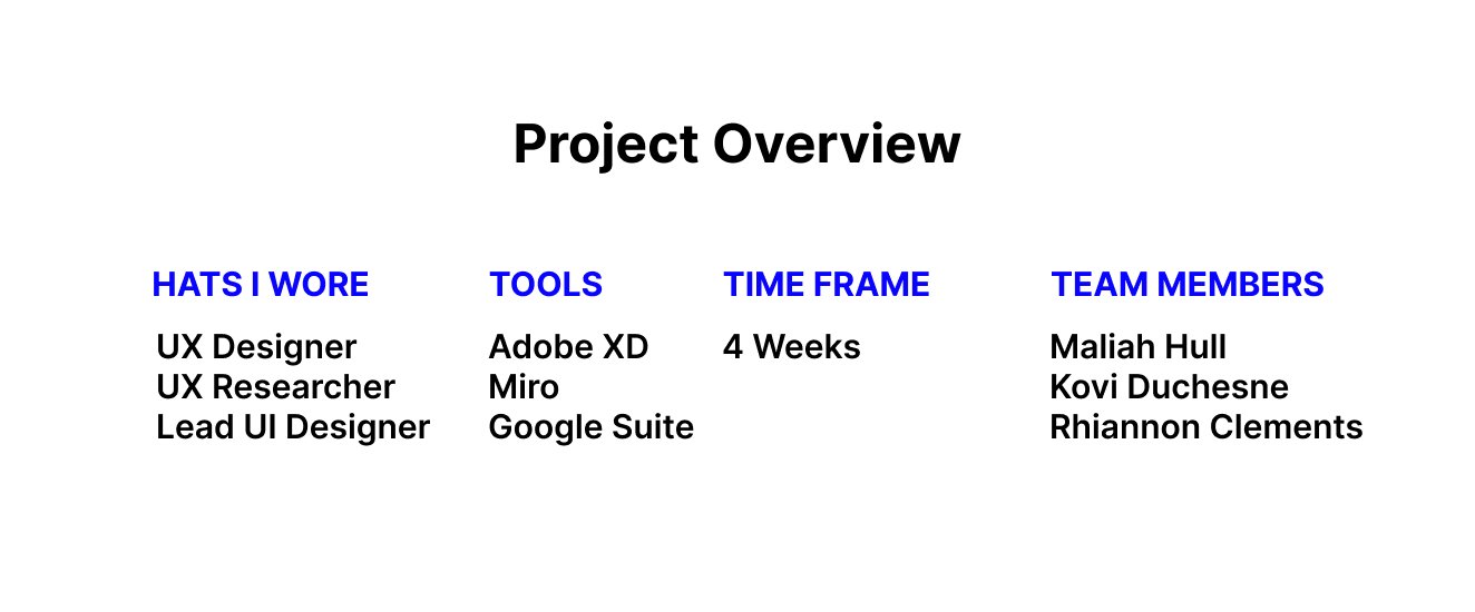
My Contributions
(Step 1)- Research
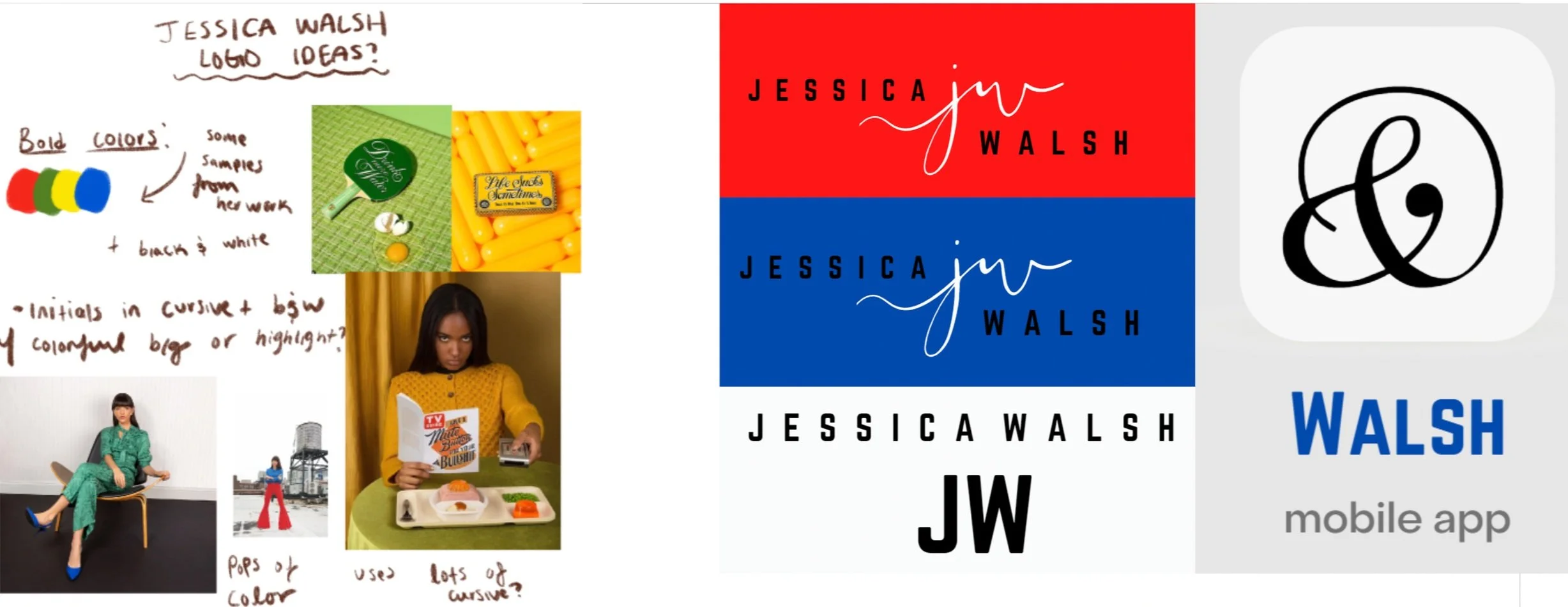
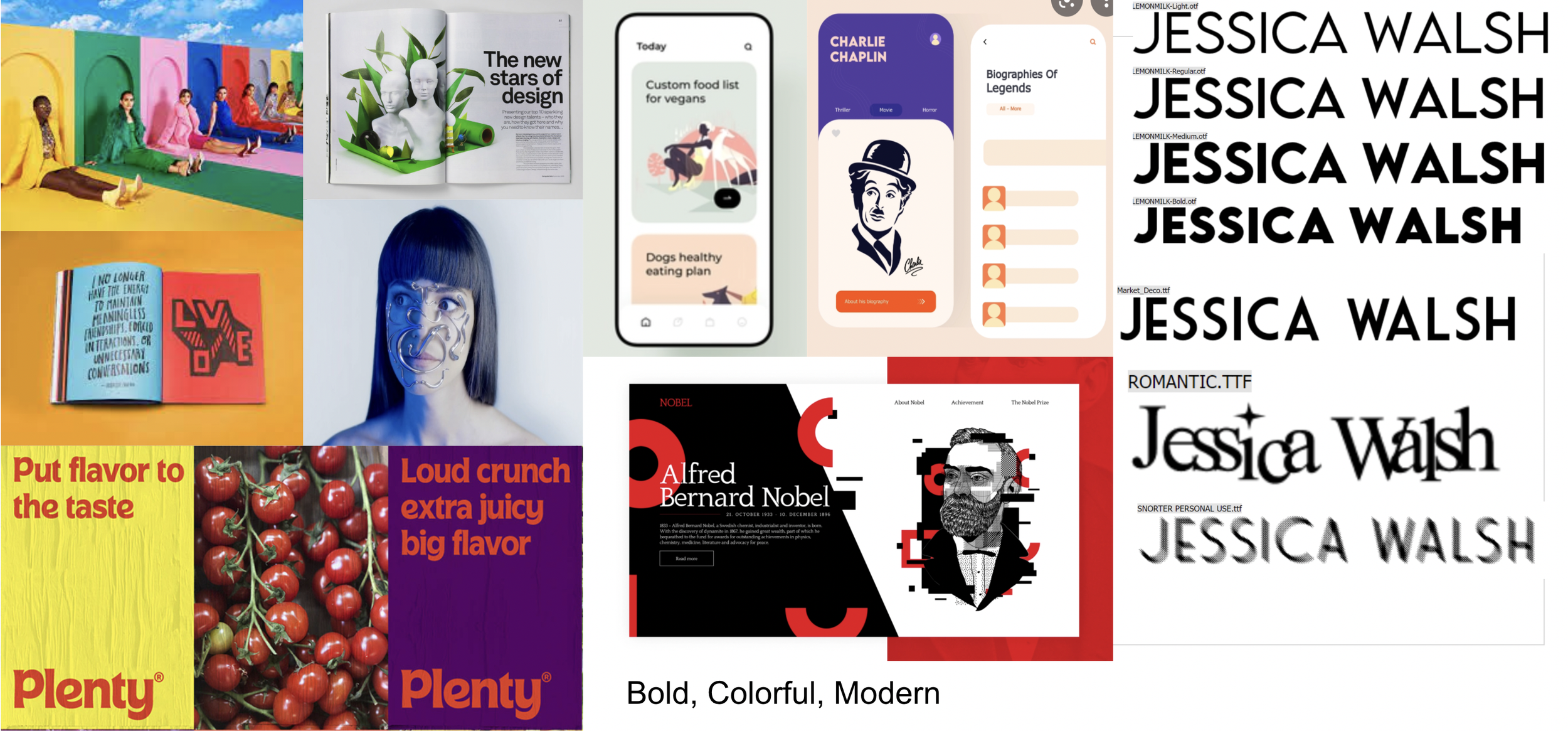
(Step 2)- Visual Design, Logo, Color & Font Rational
(Step 3)-Journey Map, Digital Designs, Prototyping, UI Design.
(Step 4)-User Testing
(Step 5)- Final Design Editing
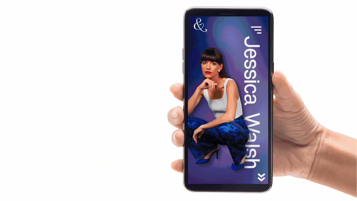
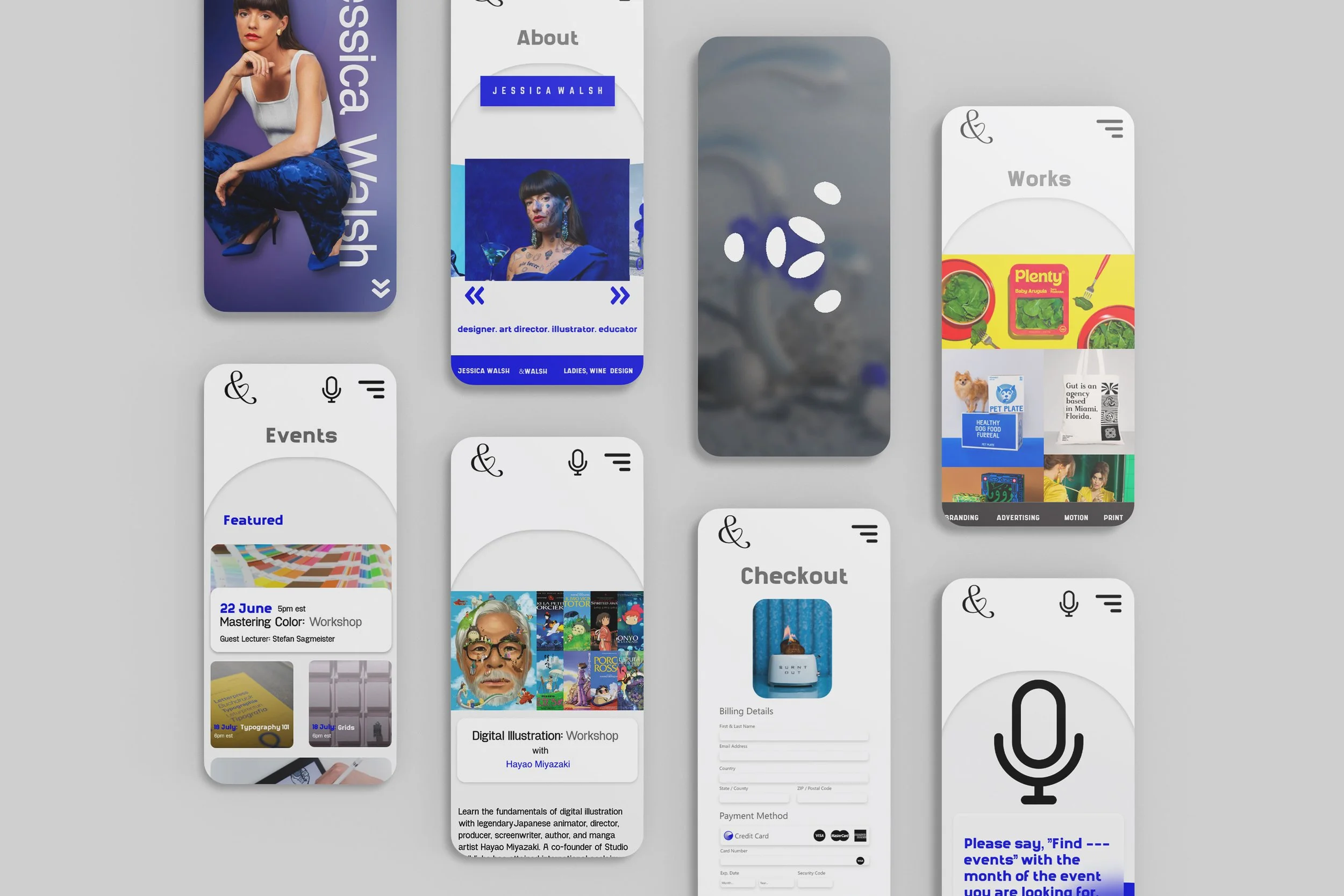
As the visual and UI designer of the team, I was responsible for the color and typography use of the app, as well as ensuring a consistent and cohesive branding identity throughout the app in order to create an effective and visually appealing design solution (interface). Deciding that bold type, an accent color (Walsh’s favorite signature blue), rounded arches, corners coupled with rectangular elements, etc. I helped to formulate a design that would suit Walsh’s existing branding and bodies of work. As the UX designer, I helped with user research, user flows, and prototyping.

What problem are we solving and how will that look visually?
When looking at our app, we want viewers to envision the bold, bright colors reminiscent of Jessica Walsh’s personal art style & information that is easy to navigate throughout the app. We can make our app easy to use by laying out the information in a clear and concise manner, such as clearly labeled sections for each area of information. We plan to have pages for a design portfolio, about section, shop page, and contact area. During development, we focused on adding an abundance of interaction between the app and the user, including interactions that will enhance the experience that the user has while exploring the app.
User Scenario | Personas | Target Users
Josh is a graphic design student living in New York City and attending college. His friend, Erica, is a big fan of Jessica Walsh's work and shows Josh her Instagram, which he finds out contains a link to download her app. Out of curiosity, he downloads it and, through the events page, finds out that Jessica also lives in New York City. He sees that Jessica Walsh is hosting future events around the area, so he decides to attend one in order to gain new knowledge about design and network.


Competitor Analysis | What can we learn?
Since Jessica Walsh (app) didn't have a clear direct competitor, we searched for other popular e-commerce / educational apps that had similar user interactions that we planned on using for our app. We analyzed many different apps with Eventbrite and Pinterest being the ones we looked at of user interaction and interface direction.
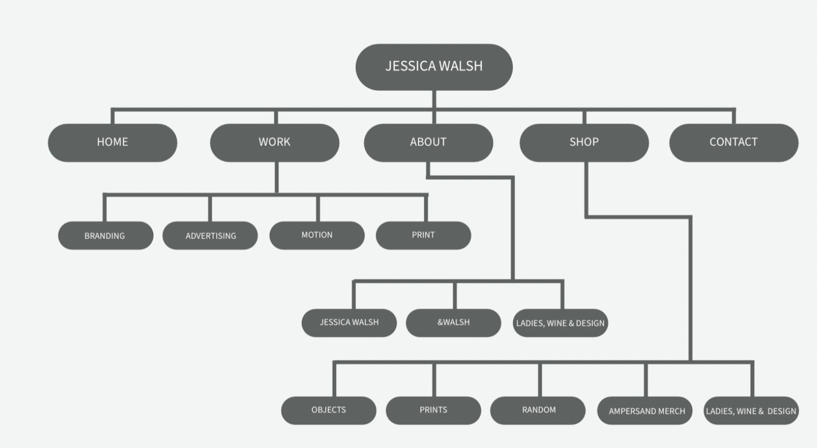
Tasks | Card Sorting | Sitemap
For this app we had three user tasks.
1) You are a graphic designer and a big fan of Jessica Walsh's work. Look at the events being hosted on the app and find an Illustration art workshop in July.
2) Your best friend’s birthday is coming up. She enjoys Jessica Walsh’s design work, so you want to buy her something from Jessica’s shop. Find the shop on the app and browse the items for sale.
3) You are a Graphic Designer who wants to learn more about famous graphic designers finds out about Jessica Walsh. You find her app and want to learn more about her and her other companies. Find the information you are looking for.
In order to figure out what pages we were going to need and what content needed to be on each, we did a card sorting. The sitemap was then created based on the card sorting groupings that we had created. Questions like how would the user find the shop, make a purchase, book an event, and learn information about Jessica Walsh were taken into consideration.

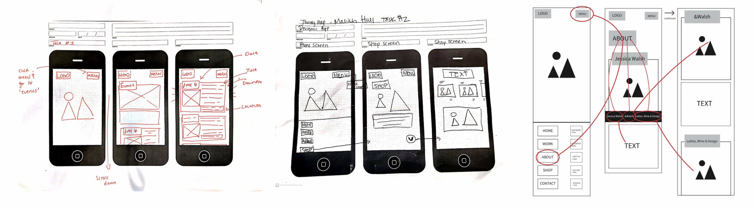
Wireframes | Journey Mapping
Low-fidelity wireframes were built in order to help with the concepting of the pages and in order to help get a feel for the layout and design. These wireframes were then sketched as low-fidelity journey maps so that prototyping for tasks could be done once the basic design of the app was done.

User Testing and Feedback
Testers enjoyed the overall design of the app, such as the colors & ease of access to navigate. They were confused at some points because of the navigational bugs due to the font not registering correctly on mobile devices. One tester also found it confusing that pressing on certain items in the app brought the user to the next page, instead of opening an overlay to interact with that item.
Items to improve upon:
Bugs in navigation, confusion of tapping leading to next page
Drop down bottom menu on About page does not work
Arrows on the bottom right of About page are confusing and do not bring you to the different sections as intended
Strengths of App:
Strong, clean design
Easy to navigate to tasks
Good color scheme used
Conclusion
After improving upon any remaining navigational bugs & readability of text, we created an app that effectively delivered information about Jessica Walsh in an interesting way. Creating a visually appealing app that adhered to Jessica Walsh’s prime aesthetic while also making it user friendly was a challenge in the beginning, but is was one that was handled arguably well by my team.